Orchid Realty Group Branding
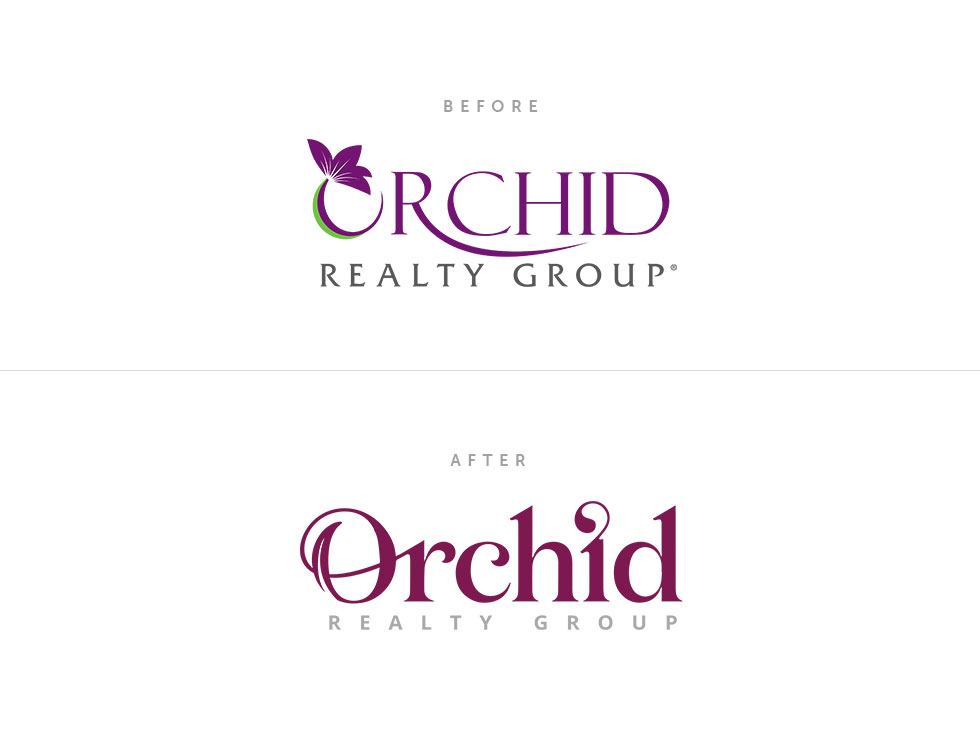
The idea behind this logo branding was the following: I wanted to reduce the femininity of the old logo (bright purple) by adding a little more red into the purple color and bring in some complimentary colors. I also wanted the logo to say Orchid without having an actual flower in the logo. I wanted the logo to have a floral feel to it (swash-like elements), and let the name, Orchid, speak for the feel. My thoughts were that having the name, Orchid, and having the actual flower in the logo is kind of forcing it. I changed the Orchid name from all caps to upper and lowercase to bring in some personality and shape the overall look of this piece.
CompanyOrchid Realty GroupProjectBrandingCityBonita Springs, FL